5 Best Practices for Better Website Navigation
Website navigation directly affects the overall success of your marketing goals. Based on this research, you can lose 50% of potential customers if they can’t find information they want. Your navigation looks like a map for your visitors and is a critical component of great web design.
The navigation can have a great impact on results. Here are two reasons:
- Traffic. The higher your content ranks, the more traffic you get from search engines.
- Conversions. If it is easy to use and understand your website, you will get a high percentage of visitors that can convert into potential customers.
Keeping that in mind, these five tips will help you create a better website navigation, a positive user experience, and you will get lots of traffic and higher conversions.
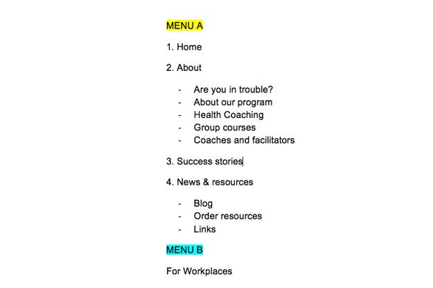
- Plan your navigation
Navigation planning is a starting point to figure out what features the website offers and the hierarchy of information. The navigation menu in the early stages is typically called as a sitemap. Because it looks like a map of your website.
There’s no rules how to do this. You can just make a draft in a Doc file, or take a paper and pen to help implement your ideas. Try to use an outline format to plan your navigation.
You can also use tools that help create sitemaps to simplify the overall process for you. Make sure to increase focus on making visual sitemaps. Check out some visual sitemap creator tools like Slickplan or Dynomapper.
2. Create a user-friendly interface
Having a user-friendly website is important to create a positive user experience. The language you consider to communicate with visitors is also not an exception. Sometimes we try to be very creative to outperform the competition and forget about users. You can get creative with your blog posts depending on your industry, but certain names should be clear and relatable in your field.
If you have no clue which words will perform better for your navigation, you can always try out the A/B testing. It can be a good starting point to help you make your navigation easy and simple to understand. For example, if you run an e-commerce business, it would be acceptable to call your store like “Shop” instead of “Marketplace”.
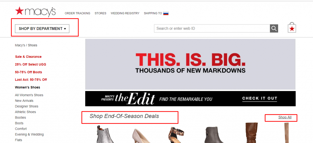
3. Reduce drop-down menus
Avoid using drop-down menus. It is difficult to navigate for a few reasons. First of all, it is hard to crawl for search engines that can cause certain problems. Secondly, they are very annoying. When users already decided to click a menu item, and you gave them other options to click, they can feel confused and leave a website.
Dropdown menus encourage users to miss important web pages. But if you decide to use these menus, include only a few necessary items. Make sure to watch your analytics to avoid problems. Here is a good example of a drop-down menu:

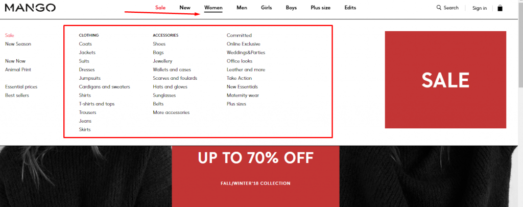
There is one exception when you can use the mega menu. If you make a large website with lots of web page and a wide range of products or services, a mega menu is the best way to organize your website navigation. Without it, users can’t find a specific product category they are looking for.
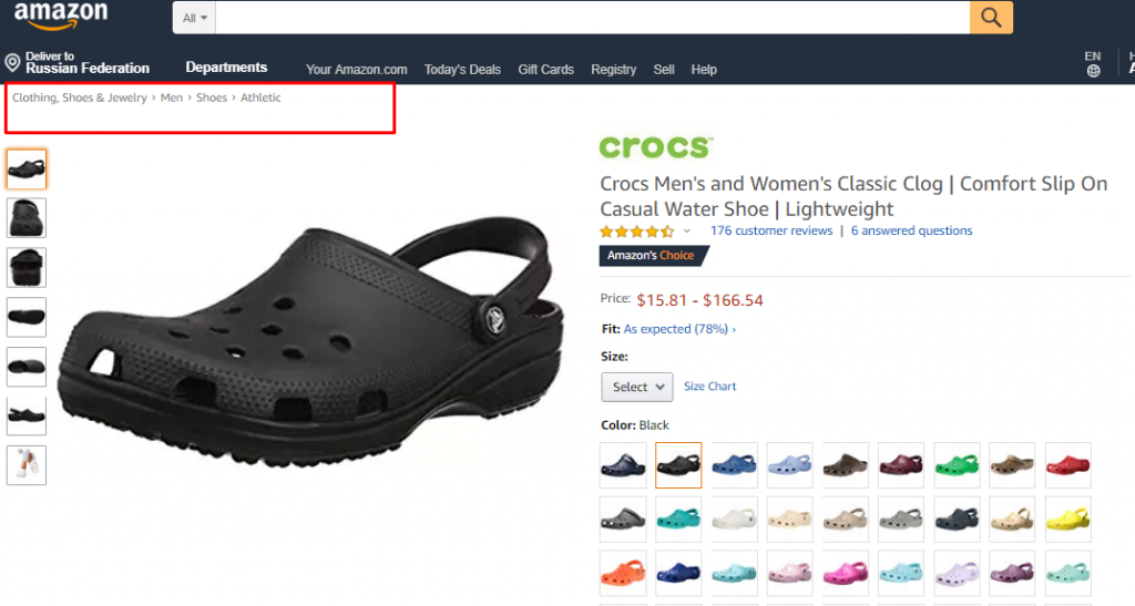
4. Indicate where the user is located
Intuitive navigation is always a good experience that shows what page you are currently reading within a site. That helps users backtrack a previous web page. Here are few tips on how to make your navigation intuitive:
- The logo should always link back to the homepage.
- The main menu should be at the top of each web page.
- Use breadcrumbs at the top of each page’s content. Let users click these breadcrumbs and go back to a previous page.
- Make highly visible buttons.
If you want to get a great user experience, you should do the best to easily guide users through your site.
5. Handle responsive navigation
Responsive design is one of the most effective ways to make your site look good on any devices. Without responsive navigation, users can’t see your content properly on phone, tablet or desktop, and they will move on to the next best site.
The trend of responsive web design is using a great mobile navigation style called “hamburger menu”. It’s an icon designed for three separated horizontal lines that allow showing a menu. Usually, it appears in the top-right of mobile sites, and, after clicking the icon, you will see the navigation menu. Here is how the hamburger menu looks like:

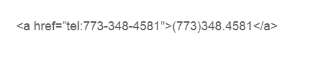
For mobile visitors, it is also important to create a clickable button to dial a phone number on your site. It is simple to do: just add tel: to your href code for the phone number on the mobile version. Here is how it should look like:
According to this study, hidden navigation can provide a worse user experience than visible navigation does. Make sure to add the word “menu”, as it helps users find the hidden navigation.
Conclusion
Website navigation is crucial for web design, and it is vital to create elaborately planned solutions relying on your customers’ needs. I hope these hot tips will give you inspiration and new ideas for your menus.
Try to create a better website navigation for both your visitors and search engines. You can see that in your analytics. Remember that a good website will make your phone ring.